Giving the Gel a Shape
Agel was a Utah-based wellness company built around a single unusual format: liquid and gel supplements sold in single-serving foil pouches with a tear-off top, rather than pills or powders. The format itself was the pitch — no water, no swallowing, just tear and go. But the packaging that carried that pitch to shelf and to customers wasn't pulling its weight.
The Problem
Each product in the line had its own color, which was the right instinct — with a dozen-plus gels covering everything from joint health to children's vitamins to metabolism, color-coding is how a customer finds their product fast. But beyond the color, the pouches leaned on arbitrary geometric shapes and abstract graphics that told you nothing about what you were actually tearing open. A new customer looking at the lineup had no way to connect a purple triangle to "contains pomegranate and blueberry" or a blue burst to "this is the one with peas and mint in it."
That's a real cost for a supplement brand. People take supplements because of what's in them. If the packaging can't communicate that at a glance, it's asking customers to take the ingredient list on faith, read a label, or just trust the color.
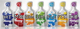
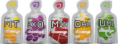
The Redesign
I rebuilt the packaging around two ideas, both aimed at the same gap: show the customer what they're getting before they tear the pouch open.
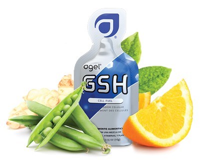
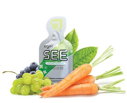
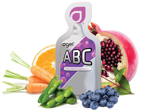
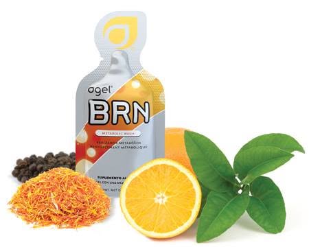
First, the pouch graphic itself was redesigned to read as the gel inside it — color, translucency, and shape built to suggest the actual product behind the foil, rather than an abstract mark standing in for it. Second, and the bigger shift, every product shot was rebuilt as the pouch surrounded by the whole ingredients it was derived from: GSH shown with pea pods, mint, and orange; SEE with carrots, grapes, and blueberries; ABC with pomegranate, carrots, soybeans, and blueberries; BRN with black pepper, saffron, and orange. The product stopped being a sealed mystery pouch and became a visible promise — here's exactly what's in your hand.
That ingredient-surround format became the core visual system for the whole line — used across packaging, catalogs, and marketing materials — so every piece a customer or a distributor saw reinforced the same story about what was actually in the gel.
Out in the World
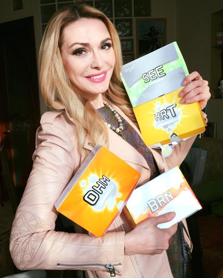
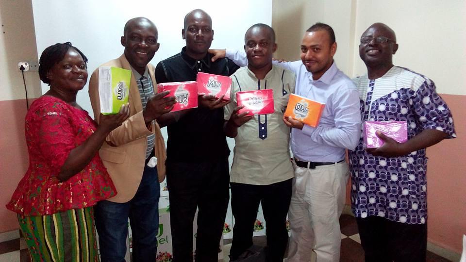
Agel sold through a distributor network that reached well beyond Utah — the same packaging system turned up in living rooms in the U.S. and at distributor meetings around the world, carried by people who'd never seen the original brand and had no context for it beyond what the box itself communicated.
Leading the Work
This one ran at a different scale than a single screen or a single product — a full line rebrand across dozens of SKUs, catalogs, event materials, and packaging, managed alongside a team of three designers. I set the visual system — the gel-like pouch treatment and the ingredient-surround photography format — then worked with the team to carry it consistently across every product and every piece of collateral built on top of it, from catalog pages to the trade-show and international-event materials the brand needed as it grew.