Coaching the Whole Player
Thurl Bailey won an NCAA championship with NC State in 1983 and spent 12 years in the NBA with the Utah Jazz and Minnesota Timberwolves. After basketball he built a youth training business, coaching kids one-on-one on fundamentals — free throws, form, speed, strength. He came to me wanting a site that did two jobs at once: sell parents on the program, and give the kids he coached a way to actually see themselves getting better.
This was a concept project — designed and prototyped for Thurl, not a shipped, live product. The two screens below are the designs I delivered.
The Brief
I met with Thurl to scope the site the way I do with any client: not "what pages do you want" but "what does a visit to this site need to accomplish." Two different people were going to land on it. A parent, deciding whether to sign their kid up, who needed to be sold on Thurl's credibility and the program's results in about thirty seconds. And a kid already enrolled, who needed a reason to keep showing up — something that made the work visible.
Those are two different design problems wearing one site. The home page had to establish trust fast: who Thurl is, what he's done, what training with him gets you. The profile page had to solve something harder — how do you show a 14-year-old their own progress in a way that reads as motivating, not like a report card they dread checking?
Selling the Program
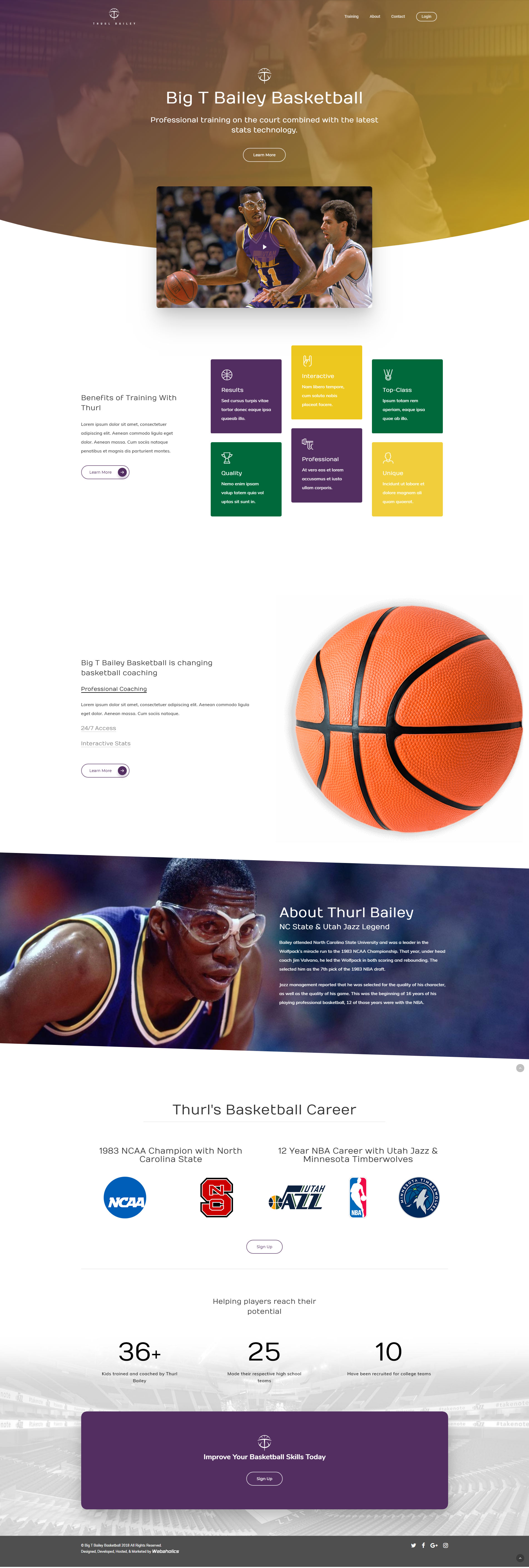
Thurl's career was the credibility, so the home page leads with it rather than burying it in an "About" link. A hero video of him on the court, then "Benefits of Training" broken into six short, scannable tiles — the kind of claims parents weigh against price. Below that, his bio: NC State's 1983 championship run, the 1983 NBA draft, 12 years with the Jazz and Timberwolves, laid out with the team and league logos so the credential registers visually before a parent reads a word of it.
The page closes on results, not adjectives: 36+ kids trained, 25 who made their high school teams, 10 recruited for college. Those three numbers do more selling than any copy on the page, so they get their own full-width section right before the sign-up call to action — the last thing a parent sees before deciding.
Making Progress Visible
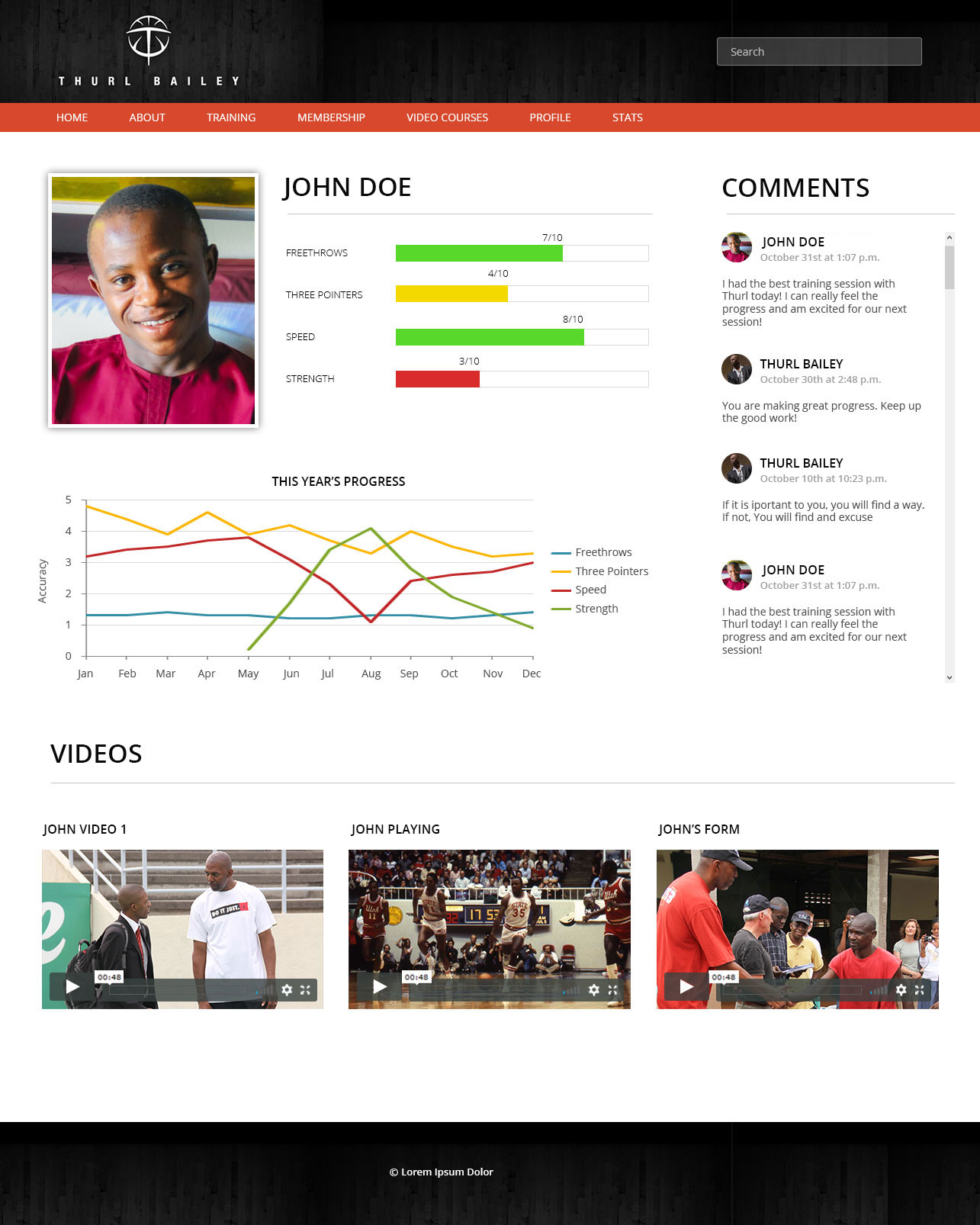
The profile page was the real design problem. Thurl was already tracking each kid on four fundamentals — free throws, three-pointers, speed, strength — but a column of numbers doesn't feel like progress to a 14-year-old. I built each metric as a color-coded bar instead: red, yellow, green against a 10-point scale, so a kid can tell at a glance whether a number is something to work on or something to be proud of, without doing math.
Underneath, a year-long line chart plots all four metrics together, so a kid can see the actual shape of their own improvement over time — strength climbing through the summer, speed holding steady — rather than just this week's snapshot. That's the difference between a stat sheet and something that feels like a story about getting better.
The other piece was the comment thread running down the right side of the page. I pushed for two-way, not one-way video feedback, because the thing that keeps a kid coming back isn't just seeing their own bar chart move — it's Thurl telling them directly that he noticed. Training videos sit below, so a kid can watch their own form and Thurl's notes on it in the same place their numbers live.
What It Took
Working solo on this one meant the scoping conversation with Thurl did the job a partner would otherwise do on a bigger team — I had to come out of it with enough to make the layout and hierarchy decisions myself, with no engineer to pressure-test a design against before it was handed off. The profile page in particular went through several passes before the bars-plus-chart combination felt right: early versions leaned harder on the raw numbers, and it took stripping those back in favor of color and shape to get something a kid would actually want to look at.